Over the years, I’ve spoken with dozens of Customer Success leaders who trusted their health scores right up until their highest-scoring accounts churned. They weren’t ignoring the data—they were drowning in it. What failed wasn’t their attention. It was the framework.
Today’s customer journeys aren’t linear. They're not bound by logins, NPS scores, or last-seen dates. They’re shaped by patterns—subtle, shifting, often invisible ones—that your health score isn’t even tracking. And by the time the red flag appears, it’s not a warning. It’s a post-mortem.
Let’s talk about why.
The Illusion of Insight
Health scores promised a shortcut to understanding risk. They aggregated signals, weighted behaviors, and gave you a number to trust. But if we’re honest, most health scores today are built on assumptions, not discovery.
Here’s the typical playbook:
- Assign weights to actions (logins, feature use, support interactions)
- Calibrate thresholds based on past behavior
- Tune over time as exceptions arise
But there’s a flaw baked into that loop: it relies on what you already know to define what matters. And what you know… is often incomplete.
Imagine a customer logging in three times a week. No tickets. High usage. Green score. What your score doesn’t show:
They skipped onboarding. Their key champion left. Their usage pattern just shifted dramatically—away from the features that align with value realization. Their renewal date is 54 days away. And no one’s talking to them.
Your score says “healthy.”
The pattern says “goodbye.”
When Symptoms Masquerade as Signals
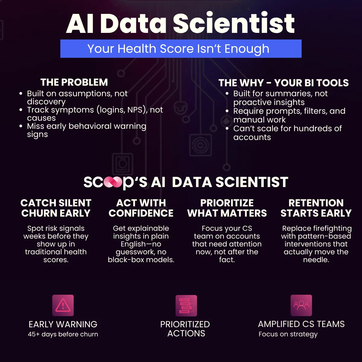
Most health scores track symptoms, not causes.
Take the login frequency. A customer logging in daily might be engaged—or they might be lost, frustrated, or frantically looking for value they haven’t found yet. NPS? A lagging indicator. Usage? Only meaningful when tied to outcomes.
What’s missing is contextual behavior.
Churn rarely comes out of nowhere. It builds over time—micro-frictions, unmet expectations, unnoticed disengagement. These aren’t things you catch with surface metrics. They’re things you uncover when you analyze behavior as a system, not a series of events.
But here’s the hard part:
Most CS teams aren’t equipped to run that kind of analysis. Not because they lack the talent, but because traditional tools don’t allow for it.
Why Traditional Analytics Fall Short
BI dashboards are built for summaries. They excel at showing what happened—but not why. And they certainly don’t tell you what’s about to happen.
I’ve seen teams spend days pulling CSVs, filtering in Excel, and correlating metrics just to answer one question:
“Who’s at risk, and why?”
The problem isn’t effort. It’s architecture.
Traditional BI tools assume:
- You know what questions to ask
- You have time to investigate
- You’ll spot meaningful shifts by eye
None of that scales.
Especially when your team manages hundreds of accounts, and your “at-risk” list is always reactive—surfaced when it’s too late to intervene.

What If the Signals Found You?
What if you didn’t have to guess which accounts were at risk? What if the system told you?
Let me sketch the future I believe in:
- You connect your data—CRM, product usage, support tickets, CS notes.
- A system continuously analyzes behavioral patterns, not just events.
- It identifies groups of accounts whose activity shifts match known churn paths.
- You get notified:
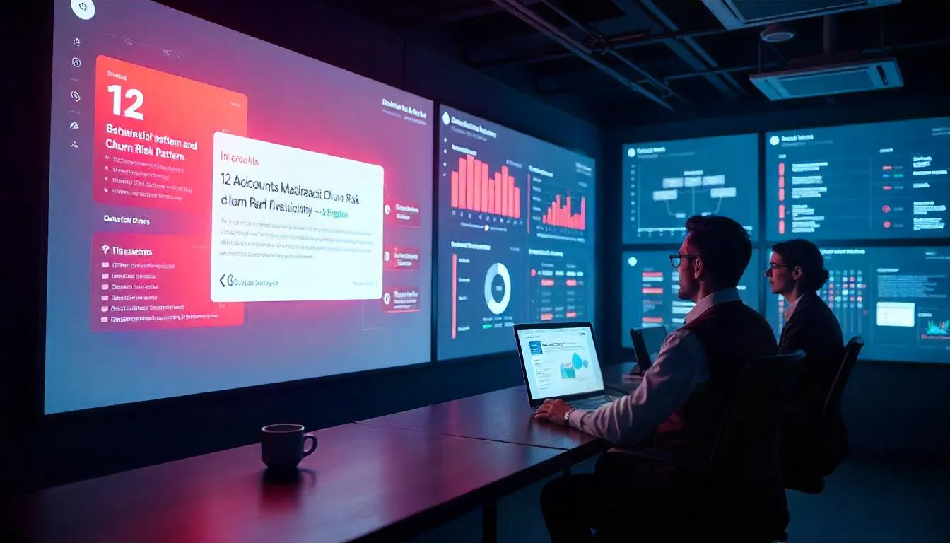
“12 accounts just entered a high-risk behavior cluster—none are flagged by your current score.”
And when you ask why, the system doesn’t give you a cryptic chart. It explains:
“Accounts with high ARR, no onboarding participation, and no activity on Feature X within 14 days show a 68% churn likelihood. These 12 accounts match that pattern.”
That’s not just a smarter score. That’s a different paradigm: proactive detection over reactive diagnosis.
Behavior Tells the Truth
In CS, the most dangerous risk isn’t the loud one. It’s the silent drift. The customer who doesn’t complain. The one who smiles through the QBR. The one whose usage metrics look fine—until you realize they’re not using the features that drive renewals.
These shifts are detectable. But only if your system looks at:
- Sequences (e.g., used Feature A, skipped Feature B, submitted a ticket, then dropped usage)
- Timing (e.g., sudden drop after onboarding, or behavior shifts around support escalation)
- Combinations (e.g., high ARR + no champion + zero interaction in 21 days)
Most health scores can’t model that. They reduce rich behavior into a single number. But churn doesn’t care about that number. It cares about momentum—and momentum lives in patterns.
So What Does a Modern System Look Like?
Let’s make this real. A modern, intelligent health detection system should:
- Continuously learn from behavior across all accounts
- Detect early warning signs up to 45+ days before churn
- Explain risk in natural language (“Low adoption + high ARR + no champion”)
- Prioritize accounts dynamically as behaviors change
- Integrate with your CRM to trigger playbooks instantly
This isn’t about replacing CS judgment. It’s about amplifying it—with intelligence that spots what humans miss and context that empowers action before it’s too late.
Why We Rebuilt the Stack
This is the exact reason we built Scoop. Not as another dashboard, but as an AI data scientist that watches your accounts for signs of risk—so your team doesn’t have to.
Instead of requiring prompts, filters, or SQL, Scoop:
- Ingests raw data from your tools
- Profiles behavior across timelines, segments, and outcomes
- Runs clustering and predictive models automatically
- Explains risk in plain English, and writes scores back to your CRM
Take a look at how the AI Data Scientist works. You don’t need to build a model. You don’t need to set thresholds. You just connect your data and start seeing patterns you didn’t know to look for.
And the best part?
It’s not a black box. Every risk prediction comes with a clickable decision tree and a human-readable rationale. So your team doesn’t just see what—they understand why.
A New Lens on Churn
Let me be clear: Health scores aren’t going away. They’ll remain a useful snapshot. But relying on them alone is like checking the weather by sticking your hand out the window. You feel what’s happening—after it happens.
The future belongs to systems that look ahead.
That spot shows the temperature drop before the storm.
That surfaces the quiet signals before the account disappears.
And when those systems work, your CS team stops firefighting—and starts preventing.
What Comes Next
If your highest-scoring customers are still churning, the problem isn’t the data. It’s how you’re interpreting it.
Signals are there. Always have been.
What you need is a system that can see them before they become outcomes—and give your team time to change the story.


.webp)