The Bridge Between Data and Decision-Making
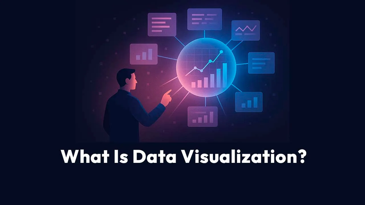
Data visualization is the process of turning complex data into visual insights—using charts, dashboards, and maps—to help teams identify trends, track performance, and make faster, more informed decisions.
It's not just about pretty graphics.
It's about clarity, action, and alignment across every level of your business operations.
Why Every Operations Team Needs Data Visualization Now
Think about your daily standups or executive meetings.
How much of the discussion centers around numbers—sales figures, on-time delivery rates, supply chain costs, customer satisfaction scores?
Now imagine trying to explain all that through spreadsheets alone.
It's slow. It's painful. It's easy to misinterpret.
That's why data visualization has become an essential operational discipline—not just a reporting feature. It's the tool that lets you see how your business is performing in real time, spot bottlenecks before they escalate, and communicate performance across teams that don't speak in SQL or pivot tables.
According to the Wharton School of Business, people process visuals 60,000 times faster than text. That means a single well-designed dashboard can convey what would take pages of numbers to explain. And research shows that companies using data visualization are 28% more likely to find timely information compared to those relying on traditional reporting methods. That's not a marginal improvement—that's the difference between reacting to problems and preventing them.
What Data Visualization Really Is
At its core, data visualization is the graphical representation of data using visual elements like charts, graphs, maps, and dashboards.
It translates abstract numbers into concrete patterns you can interpret instantly.
When done right, data visualization bridges two worlds: raw analytics and human understanding. It's the final stage of the data pipeline—the point where insight becomes visible.
For operations teams, this is where "data-driven" stops being a buzzword and starts driving actual performance.
Let's say you manage logistics for a nationwide distributor. Every morning, you're flooded with data: shipment times, warehouse capacity, fuel costs, delivery delays. A line chart might reveal rising costs, but a map overlay might show where those costs spike—say, in a specific region affected by weather or traffic patterns.
That's the magic of visualization: it turns raw numbers into operational foresight.
How Does Data Visualization Work?
Data visualization works by taking structured or unstructured data, cleaning and transforming it, and then displaying it in a visual format that reveals relationships, patterns, or anomalies.
The fundamental process follows five stages:
1. Data ingestion — pulling information from your systems (ERP, CRM, HR, IoT sensors, APIs, or cloud storage).
2. Data transformation — inconsistencies removed, metrics standardized, dimensions defined.
3. Visualization creation — selecting the chart type (bar, line, heat map, etc.) that best represents your data.
4. Interactivity addition — filters, drill-downs, and dynamic elements let users explore the data without needing SQL queries.
5. Distribution — dashboards shared via web links, embedded in applications, or scheduled as automated reports.
Modern tools like Tableau, Power BI, or Qlik take this further by suggesting appropriate chart types based on your data structure. You're not starting from a blank canvas—the tool guides you toward effective visualizations.
In operations, this means moving beyond static monthly reports to real-time dashboards. Imagine watching order volume rise in one region and seeing inventory depletion in another—all on the same screen. That's not just data—it's operational intelligence at work.
What Are the Types of Data Visualization?
There are many types of data visualization, from basic charts to complex dashboards. The best type depends on what question you're trying to answer.
| Purpose | Visualization Type | Example Use Case |
|---|---|---|
| Compare performance | Bar or column chart | Sales by product or region |
| Show change over time | Line chart | Weekly revenue or defect rate |
| Reveal proportions | Pie or donut chart | Expense allocation |
| Show relationships | Scatter plot | Cost vs. quality correlation |
| Display distribution | Histogram or box plot | Shipment times or defect variance |
| Track location | Geographic map | Route optimization or territory analysis |
| Monitor KPIs | Dashboards | Real-time operational performance |
Don't just visualize data for the sake of aesthetics—visualize to answer a question.
• "Which process is slowing down production?"
• "Where are we leaking revenue?"
• "Which region delivers the best margins?"
Your visualization choice should align directly with the business question you're trying to solve.
Why Is Data Visualization Important in Business Operations?
Because decisions made from visuals are faster, clearer, and more accurate.
Data visualization helps operations teams identify inefficiencies, monitor KPIs, and align cross-functional goals.
Operations is about movement—of goods, people, money, and information. But movement without visibility is chaos. Data visualization gives teams that visibility, so they can see cause and effect in real time.
Let's look at some examples:
• In supply chain: A logistics manager uses a heat map to detect warehouse congestion. Instead of waiting for monthly reports, they redirect shipments proactively.
• In HR operations: A staffing dashboard reveals that overtime costs spike in one department. The insight triggers a staffing model adjustment before burnout sets in.
• In finance operations: A real-time dashboard shows invoice aging, helping CFOs anticipate cash flow bottlenecks.
In every case, visual data creates operational agility.
What Data Visualization Does That Raw Data Can't
Raw data tells you what happened. Visualization shows you why it happened and what to do next.
A spreadsheet with 20,000 rows of data might hide critical anomalies. A scatter plot can expose them instantly. Humans excel at recognizing patterns visually. That's why data visualization unlocks operational insight that traditional reports can't.
Imagine you manage an e-commerce warehouse. Your table of daily order data looks fine—until you plot it on a heat map and realize that delays spike on weekends, right when your staffing dips. Visualization doesn't just describe problems—it reveals them.
And sometimes the problem isn't even on your radar yet. One operations director noticed a sudden 15% drop in revenue but couldn't isolate the cause through spreadsheets. By shifting to a natural language analytics approach, the investigation surfaced a 340% spike in mobile checkout failures, traced back to a recent deployment. The total impact: $430,000 in lost revenue—identified and fixed in two hours instead of two weeks. The visualization suite made the case instantly visible to engineering.
That's what operational data visibility looks like in practice.
What Are the Benefits of Data Visualization for Operations Teams?
Data visualization transforms how operations teams analyze, communicate, and act on data—leading to faster decisions, better collaboration, and measurable efficiency gains.
1. Faster Decision-Making
Visualization eliminates the cognitive friction of reading endless reports. You see outliers, shifts, and gaps immediately. When a dashboard updates in real time, managers respond in minutes instead of days. Real implementations back this up: a leading third-party logistics provider achieved 75% faster data processing and 62% improvement in decision-making efficiency simply by moving to live dashboards.
2. Improved Cross-Team Communication
Charts bridge the gap between technical and non-technical staff. The warehouse manager, the finance lead, and the CEO can look at the same dashboard and interpret it the same way.
3. Pattern Recognition
Humans are wired for pattern detection. Visualization leverages that instinct, helping you catch seasonal trends, anomalies, and risks before they escalate.
4. Accountability and Transparency
When KPIs are visualized and shared, accountability skyrockets. Teams align on the same source of truth.
5. Cost Optimization
Operational inefficiencies—like redundant inventory or production downtime—become glaringly obvious once visualized. What was once hidden in cells becomes visible in color-coded clarity. One distribution company discovered their routing algorithm was optimized for speed rather than cost in low-density regions. A single visual investigation surfaced the fix—and saved $480,000 annually.
How to Implement Data Visualization in Your Business Operations
Implementing data visualization requires clear objectives, reliable data sources, and the right visualization tools.
1. Define Your Goals. What decisions do you want to improve? Tracking daily shipments? Forecasting staffing? Define your operational questions first.
2. Audit Your Data Sources. Integrate systems—ERP, CRM, finance, HR, IoT—to ensure your visualizations pull from clean, consistent data.
3. Choose the Right Tool. Tools like Tableau, Power BI, Qlik Sense, and Domo are popular because they connect directly to operational data and support real-time dashboards.
4. Design with Purpose. Follow the "less is more" rule. Use consistent color schemes, clear legends, and contextual labels. Avoid visual clutter.
5. Enable Interactivity. Filters, drill-downs, and hover-over tooltips let users explore data intuitively without needing SQL queries.
6. Run a Proof of Concept. Select one operational area—warehouse logistics or production efficiency—and test 2–3 platforms over 30 days. Which one did your team actually use? Which generated actionable insights? Which caused frustration?
7. Train Your Team. Visualization is only powerful if your team understands how to interpret it. Invest in data literacy training.
A successful implementation isn't about dashboards alone—it's about culture. Encourage teams to start every meeting with visuals, not numbers. Make "show me the data" a standard operating practice.
What Data Visualization Tools Should Operations Teams Consider?
The right data visualization tool depends on your team's technical ability, integration needs, scalability goals—and budget.
| Tool | Best For | Key Feature | Approx. Cost |
|---|---|---|---|
| Tableau | Enterprise operations | Powerful storytelling dashboards; connected to virtually any data source | $70+/user/mo |
| Power BI | Microsoft ecosystems | Seamless Excel, Azure, and Dynamics integration | $10–20/user/mo |
| Qlik Sense | Interactive exploration | Associative analytics engine — explore data relationships freely without building new reports | Enterprise pricing |
| Domo | Real-time operations | 1,000+ pre-built connectors; mobile-first with alerts and governance | Enterprise pricing |
| Looker Studio | Cloud-first environments | Free for basic use; integrates with Google Analytics, Sheets, BigQuery | Free (basic) |
| Scoop Analytics | AI-powered, no-code insights | Natural language queries; AI auto-selects chart type; Slack-integrated | $15–30/user/mo |
| Excel | Quick visual summaries | Accessible and familiar; no additional license needed | Included in M365 |
If your organization already uses Microsoft 365, Power BI's integration makes adoption frictionless. If you need governance and real-time updates, Domo shines. For complex multi-source data blending, Qlik and Tableau are leaders.
There's also a newer category worth noting. Tools like Scoop Analytics take a fundamentally different approach—one that removes technical barriers entirely. Instead of learning dashboard builders, operations leaders simply ask questions in plain English: "Show me production trends by facility for the last quarter" or "Why did throughput drop last week?" The AI investigates multiple hypotheses, identifies root causes, and creates the appropriate visualization—bar chart, line graph, heat map—automatically. And because it integrates with Slack, your team gets answers without switching tools.
How to Budget Realistically
Free doesn't mean worthless, and expensive doesn't guarantee success. Here's a practical framework for budget planning:
• $0–500/month — Google Looker Studio, Excel (for quick wins and teams just starting out)
• $500–5,000/month — Power BI or Tableau Creator licenses for small to mid-sized teams
• $5,000+/month — Enterprise Tableau, Qlik, or Domo with full governance and integration
Remember: total cost includes licenses, training, implementation, and ongoing maintenance. A "cheaper" tool that requires constant IT support may cost more in the long run than a pricier platform with better self-service capabilities.
What Skills Does Your Team Need?
You don't need to hire data scientists. But you need some combination of the following capabilities across your team:
• Basic data literacy — understanding what data means and how to interpret it
• Tool proficiency — comfort with at least one visualization platform
• Design thinking — knowing what makes a visualization clear vs. cluttered
• Business context — understanding operations well enough to visualize what actually matters
Here's something that's shifting the equation: you might not need all of those skills anymore—at least not in the traditional sense. Natural language platforms let your most experienced operations people do what they've always been good at—asking the right questions—without needing to know SQL, DAX, or any dashboard-building syntax. The gap between business knowledge and data access is closing fast.
What Are Common Data Visualization Mistakes (and How to Avoid Them)?
Common mistakes include overcomplicating visuals, using misleading scales, ignoring context, and choosing the wrong chart type.
Operations leaders often fall into the "more is better" trap—packing dashboards with every available metric. One manufacturer created a dashboard with 73 different KPIs. Nobody used it. They rebuilt with 12 critical metrics and finally started driving operational improvements. That's noise, not insight.
Here's how to avoid the most common pitfalls:
• Simplify — Focus on 3–5 core KPIs per dashboard
• Contextualize — Always include time frames, benchmarks, or targets
• Be Accurate — Never manipulate axes or colors to exaggerate results
• Be Accessible — Use color palettes that accommodate colorblind users and responsive designs for mobile views
• Go Live, Not Static — Beautiful PDFs are outdated before they're distributed. Build interactive dashboards with live data connections. When visualizations live in Slack or embedded portals, they're always current—and always accessible from the floor
• Don't Ignore Mobile — If the majority of your operational team works away from desks, desktop-only dashboards fail. Test every visualization on mobile devices
Exploratory vs. Explanatory Visualization: What's the Difference?
Exploratory visualizations help analysts discover insights. Explanatory visualizations communicate those insights to others.
Exploratory visuals are dynamic—they invite "what if" questions. You might filter data, zoom into anomalies, or change variables.
Explanatory visuals, on the other hand, are static or semi-interactive—they guide the viewer toward a specific conclusion.
Exploratory: An operations analyst filters logistics data to find why delivery delays are increasing.
Explanatory: That same analyst presents a chart in the executive meeting showing a 20% delay spike due to one supplier.
Both are vital. One fuels discovery; the other drives action.
How Data Visualization Transforms Operational Culture
Data visualization transforms operational culture by replacing opinions with evidence, silos with collaboration, and confusion with shared clarity.
Imagine your daily operations meeting without finger-pointing or guesswork. Instead, you pull up a dashboard showing metrics everyone agrees on—updated in real time. The conversation shifts from "What happened?" to "What should we do next?"
That's why many organizations now talk about "data democratization"—making data accessible across roles, not just IT. Visualization is the key that unlocks it.
How Does Data Visualization Support Decision-Making?
It supports decision-making by helping teams spot trends, anomalies, and opportunities instantly—turning data into decisions at the speed of thought.
Instead of waiting for end-of-month reporting cycles, teams can make micro-decisions daily.
• Should we reroute inventory?
• Is that machine underperforming?
• Are we overspending on logistics this quarter?
When everyone has visibility into KPIs through live dashboards, decisions become faster and more confident.
Consider this: a manufacturing company used visualization to track equipment uptime across five plants. The dashboard revealed one site with 12% higher downtime due to maintenance scheduling gaps. By adjusting staffing, they reduced downtime by half in three months. Visualization didn't just highlight the issue—it directed the solution.
Similarly, a software technology firm that adopted visualization across project management saw 30% faster product releases, a 35% improvement in project success rates, and 42% enhanced team productivity. When you can see problems clearly, you solve them faster.
What Makes a Great Data Visualization?
A great data visualization is clear, contextual, and actionable—it communicates insight without explanation.
The 3 Cs of Effective Visualization
1. Clarity — Viewers should understand what they're seeing within five seconds.
2. Context — Every chart needs labels, legends, and benchmarks.
3. Consistency — Use uniform colors and design across all dashboards for intuitive navigation.
And every visualization needs these five elements to earn its place:
• Clear title — "Q4 Production Output by Facility" not "Chart 1"
• Labeled axes — Don't make viewers guess
• Units of measurement — Tons? Pallets? Units per hour?
• Time period — When does this data represent?
• Benchmark or target — Is this good or bad performance?
In operational reporting, the goal isn't to impress—it's to inform. Fancy gradients and animations may distract from what matters most: the decision that follows the data.
What Questions Should You Ask Vendors?
When evaluating data visualization tools, ask questions that reveal capabilities beyond marketing promises:
1. "How long does implementation typically take for companies our size?"
2. "What data sources connect natively vs. requiring custom development?"
3. "How do you handle data refresh rates—can we get real-time updates?"
4. "What does your training program include, and what's the typical learning curve?"
5. "Can you show us customer examples from our specific industry?"
6. "What happens to our dashboards if we decide to switch platforms later?"
7. "How do you handle data security and compliance requirements?"
What's Your Next Step with Data Visualization?
If data visualization still feels like a future project rather than a present priority, this framework will help you get moving.
This Week
• Identify one operational pain point where better data visibility would help
• Choose a simple tool you already have access to
• Build one basic visualization that addresses that specific pain point
This Month
• Audit your existing data sources for completeness and consistency
• Research appropriate tools using the comparison table above
• Launch a pilot project with one high-value dashboard
• Begin identifying who on your team will own visualization going forward
This Quarter
• Develop a visualization roadmap tied to your top operational priorities
• Invest in training or adopt a tool that removes the training barrier entirely
• Establish governance standards—who publishes, who reviews, what gets shared
• Measure impact: is decision speed improving? Are meetings getting shorter?
FAQ
What is data visualization?
It's how we turn data into visuals like charts and graphs so that people can quickly understand what's happening and take action.
Why is data visualization important for business operations?
Because it helps teams see inefficiencies, track KPIs in real time, and make decisions faster than traditional reports ever could.
What are examples of data visualization in operations?
Performance dashboards, delivery heat maps, cost trend lines, staffing allocation charts, and root cause analysis visualizations.
What makes data visualization different from data analysis?
Analysis finds insights; visualization communicates them. They're two sides of the same coin—one extracts meaning, the other makes it visible. Business intelligence (BI) is the broader discipline; data visualization is the presentation layer that makes BI actionable.
Do I need a data scientist to use these tools?
No. Modern platforms like Power BI and Tableau are designed for business users. Advanced features may require technical skills, but operational dashboards don't. And with natural language tools, if you can ask a question, you can create a visualization.
What does data visualization software typically cost?
Google Looker Studio is free for basic use. Power BI starts around $10–20/user/month. Tableau ranges from $70/user/month to custom enterprise pricing. Natural language platforms typically run $15–30/user/month. Budget an additional 3–5x the license cost for implementation, training, and maintenance.
What's the ROI timeline for implementing data visualization?
Most operations teams see initial returns within 3–6 months through faster reporting and improved decision speed. Deeper ROI from operational optimization typically emerges at 6–12 months. Companies consistently report 28% faster access to critical information immediately after implementation.
Should we build custom visualizations or use pre-built templates?
Start with templates. Most platforms offer industry-specific dashboard templates that solve 80% of common needs. Customize gradually as you identify gaps. Custom development makes sense for unique operational workflows that standard templates don't address.
How can I improve my data visualization skills?
Study examples from platforms like Tableau Public, learn Edward Tufte's principles of clarity, and practice simplifying your charts until the message is unmistakable.
Conclusion
If you remember one thing about what data visualization can do, it's this:
It's not a decoration—it's direction.
The best visualization strategies don't just show data; they make it impossible to ignore what needs to be done next. And the barrier to entry has never been lower. You don't need to become a data scientist, launch a six-month implementation project, or invest in enterprise software on day one.
Start small. Pick one operational challenge. Choose a tool. Build a dashboard. Show your team. Then watch as data you already had becomes insights you never saw coming.
So the next time someone asks, "What is data visualization?", you can say confidently: "It's how we see the truth in our data—and act on it before it's too late."