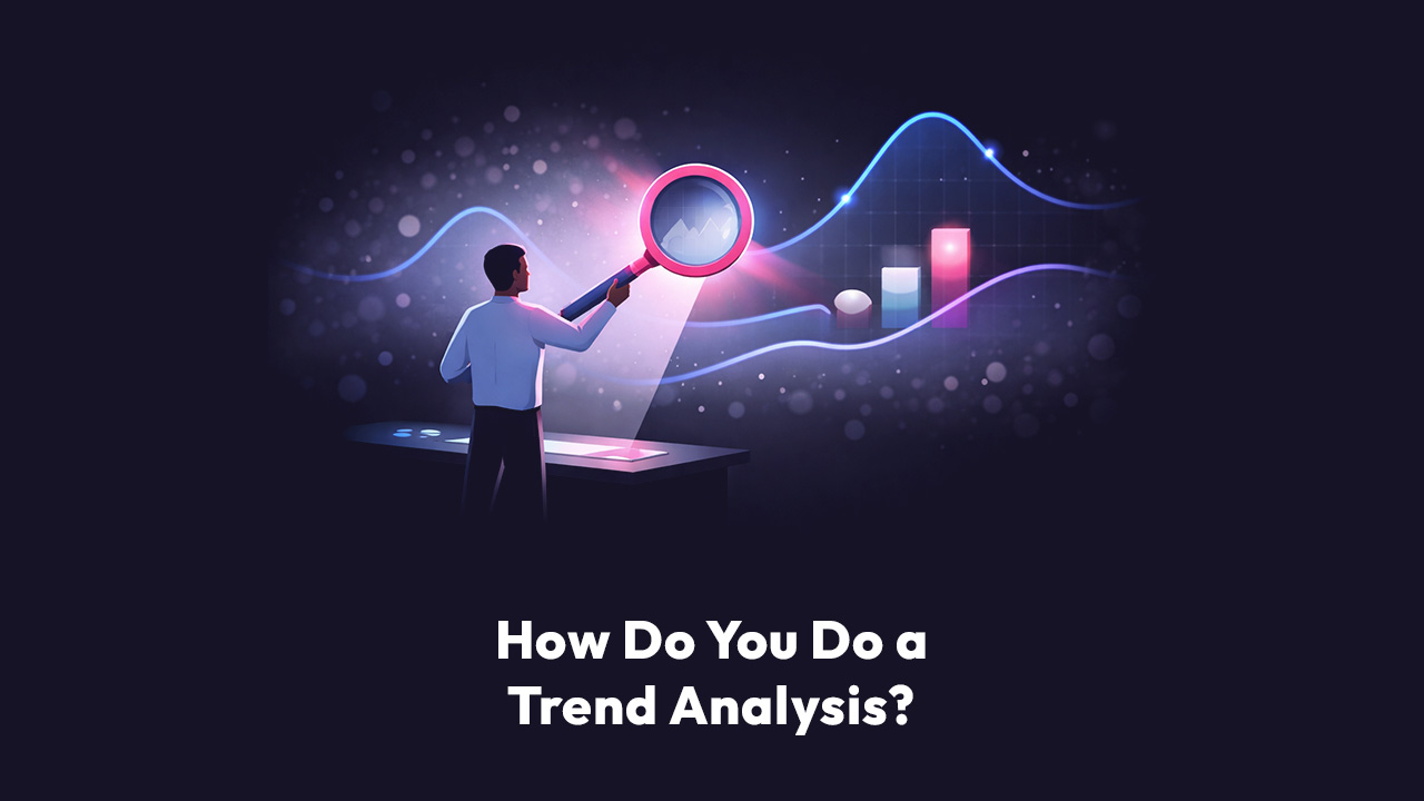
How to do trend analysis?
Trend analysis is the practice of collecting information and attempting to spot a pattern. In business operations, this means comparing data over time—like revenue, churn, or user activity—to identify consistent results or trends. By analyzing these historical patterns, leaders can predict future outcomes and make informed strategic decisions rather than reacting to daily noise.
The "So What?" Factor
You are sitting in a Quarterly Business Review (QBR). The Chief Revenue Officer points to a red arrow pointing down on a dashboard. "Why is churn up 5% in LATAM?" she asks.
The room goes silent.
If your answer is, "I'll pull the logs and get back to you next week," you have lost the room. You have become a bottleneck.
If your answer is, "We identified a trend starting December 5th where SMB customers in Mexico spiked in churn due to a specific billing friction point, and we’ve already deployed a fix," you are a strategic partner.
That is the power of effective analysis. It isn't just about drawing lines on a chart; it is about solving the "Last Mile" problem of business intelligence—bridging the gap between raw data and executive decision-making.
In this guide, we are going to walk through exactly how to do trend analysis that goes beyond vanity metrics. We will look at how to uncover the why behind the what, using real-world examples that might feel uncomfortably familiar.
What is Trend Analysis?
What is trend analysis in the context of modern operations?
It is a statistical technique used to evaluate historical data to identify the direction of a specific variable. In plain English? It’s the difference between a snapshot and a movie. A snapshot tells you where you are; a movie tells you where you are going.
For RevOps and FinOps leaders, looking at a single month's P&L is useless without context. Is that $40k drop in revenue a blip, or is it the start of a catastrophe? Trend analysis answers that question.
The Three Types of Trends You Will See
When you dig into your data, you generally look for three specific patterns. Recognizing which one you are dealing with is half the battle.
- Secular Trends: These are long-term movements that happen over years.
- Example: The slow but steady shift of your customer base from perpetual licenses to SaaS subscriptions. You don't react to this weekly; you plan for it annually.
- Seasonal Trends: These are predictable fluctuations based on the calendar.
- Example: Your Q4 sales spike or the notorious "summer slump" in B2B lead generation.
- Irregular Trends: The anomalies. The spikes. The bugs.
- Example: A sudden drop in billing because a "glitch" gave every MidMarket customer a 20% discount.
Expert Note: Most dashboards are great at showing you Seasonal trends but terrible at spotting Irregular ones until it’s too late. This is where Domain Intelligence—encoding your expertise into the system—becomes critical.
How to Do Trend Analysis: A 5-Step Framework
You don't need a PhD in data science to do this, but you do need a disciplined process. Here is how we break it down, moving from basic observation to advanced investigation.
Step 1: Define Your "North Star" Metric
Don't boil the ocean. Pick the metric that matters right now. Are you trying to solve revenue leakage? Fix churn? Improve CSAT?
- Bad Goal: "Look for trends in our data."
- Good Goal: "Analyze industry trend analysis regarding our MidMarket payment failures over the last 6 months."
Step 2: The Clean-Up (Data Preparation)
This is the part everyone hates. You export five different CSVs—invoices.csv, customers.csv, subscriptions.csv. You open Excel. You start VLOOKUP-ing until your eyes cross.
The Reality Check:
Data prep is usually 80% of the work. If your data isn't clean, your trends are lies.
- Are your dates formatted consistently?
- Are "NULL" values zeroes or missing data?
- Did the "Source System" tag your Stripe data differently than your Wire Transfer data?
At Scoop, we recognized that this "grunt work" kills analysis. That's why we built a Spreadsheet Engine layer directly into our analytics platform. It allows you to clean, bin, and transform data using the Excel formulas you already know, but without the risk of a manual copy-paste error destroying your model.
Step 3: Visualize the Time Series
You need to plot your data points on an X-Y axis. Time goes on the X-axis. Your metric goes on the Y-axis.
Ask yourself:
- Is the line generally going up, down, or flat?
- Are there spikes that repeat every month?
- Is there a cliff?
Step 4: The Investigation (Finding the "Why")
This is where traditional BI tools fail. They show you the line went down. They don't tell you why.
Let's look at a practical example using a synthetic dataset that mirrors a real SaaS disaster we recently analyzed.
The Scenario:
Imagine you are the VP of Ops. You look at your trend line for December 2025. Revenue is down. Panic sets in.
The Lazy Analysis:
"Revenue dropped due to seasonality." (This is a guess).
The "Scoop" Analysis (The Investigation):
We dig deeper. We don't just look at the aggregate. We look at the attributes using a multi-hypothesis approach.
- Segment: Is it all customers? No, the data shows Enterprise is flat. SMB is flat.
- MidMarket is down.
- Region: Is it global? Yes, it's affecting MidMarket globally.
- Root Cause: We drill into the raw invoice data.
- Observation: Invoice I10002512 for Customer C1000 shows an amount_due_usd of $474.05.
- Expectation: The subscription price is $499 with a standard 5% discount. $499 * 0.95 = $474.05.
- The Anomaly: Suddenly, dozens of invoices in December show a variance where the math doesn't add up.
The Discovery:
By analyzing the trend of discounts applied vs. standard pricing, you find that a "billing bug" was introduced in the December release that accidentally applied an extra discount layer to MidMarket renewals.
This is the difference between reporting news and making news.
Step 5: Take Action
Data without action is just overhead.
- If it's a negative trend: Intervene. (e.g., "Roll back the billing code update.")
- If it's a positive trend: Double down. (e.g., "The LATAM marketing campaign is working; increase budget.")
Industry Trend Analysis: Looking Outward
While internal analysis focuses on your metrics, industry trend analysis looks at the market. You cannot operate in a vacuum.
How do you conduct industry trend analysis?
1. Competitor Benchmarking
Are you growing slower than your peers? If your churn is flat at 5%, but the industry average has dropped to 2%, you are technically falling behind. Use industry reports to set the baseline for your internal trend lines.
2. Consumer Behavior Shifts
Are customers moving away from annual contracts to monthly ones? In 2026, we are seeing a massive shift toward "consumption-based" pricing. If your trend analysis shows a dip in Annual Recurring Revenue (ARR) but a spike in usage fees, you aren't dying—you're evolving.
3. Technological Disruptions
Is AI adoption making your "manual service" obsolete? Industry trend analysis requires you to look at search volume data, analyst reports, and emerging tech stacks to ensure your 5-year plan isn't built on obsolete technology.
The "Last Mile" Problem: Why Excel Isn't Enough
We have all been there. You have a massive spreadsheet. You have found a trend. Now you have to explain it to the CEO.
You spend four hours building a slide deck. You take screenshots of your charts. You write bullet points explaining the "Billing Bug." You email it out. Three days later, the CEO replies: "What does this mean for Q1?"
This is the "Last Mile" problem.
Great data pipelines fail in the boardroom because the insight gets lost in translation. The analysis is trapped in your head or your spreadsheet.
The Solution? Automate the Explanation.
This is where Scoop Analytics changes the game. We realized that how to do trend analysis isn't just about the math; it's about the narrative.
Scoop utilizes a unique 3-layer architecture to solve this:
- Layer 1: Automated Data Preparation
The system ingests your raw CSVs or connects to your warehouse. It cleans the data using that spreadsheet engine we mentioned earlier—handling the messy dates and NULL values automatically. - Layer 2: Machine Learning (The Weka Library)
Instead of you manually hunting for the MidMarket anomaly, Scoop’s ML layer runs thousands of permutations. It detects that the variance in Revenue is statistically significant and correlates specifically to the MidMarket segment. - Layer 3: Business Explanation (Natural Language Generation)
This is the magic. Instead of just showing a chart, Scoop generates a briefing in plain English.- Scoop Output: "Revenue is down in Dec 2025 because MidMarket invoices have a higher-than-average discount rate. This appears to be a billing anomaly, not a churn event."
It is like having a data analyst who never sleeps, knows every row of your data, and speaks perfect business English.
FAQ
What are the best tools for trend analysis?
While Excel and Google Sheets are the standard starting points, they risk manual error and version control nightmares. BI tools like Tableau or PowerBI are great for visualization but struggle with explanation. Modern platforms like Scoop Analytics combine the flexibility of a spreadsheet with the power of AI to not just visualize the trend, but explain the root cause autonomously.
How much historical data do I need?
To spot a reliable trend, you generally need at least 3 to 4 "periods" of data. If you are analyzing monthly churn, you need 4 months to see a pattern. However, for industry trend analysis, you ideally want year-over-year data (13+ months) to account for seasonality.
What is the difference between trend analysis and forecasting?
Trend analysis is looking backward to understand the pattern. Forecasting is projecting that pattern forward. You cannot have a reliable forecast without accurate trend analysis first.
Summary: Stop Guessing, Start Investigating
How to do trend analysis effectively comes down to curiosity. It is about refusing to accept the surface-level metric.
- Don't just say "Sales are down."
- Do identify that "Sales are down because SMB churn in LATAM spiked between Dec 5th and Dec 20th."
The best operations leaders are detectives. They use data to build a case. But unlike detectives, you don't have to work alone anymore.
Imagine if you had an analyst who never slept, knew every row of your data, and could tell you why a number changed before you even finished your morning coffee. That isn't science fiction. That is Domain Intelligence.
Ready to see what your trends are actually saying? Stop drawing lines in Excel and start having a conversation with your data.
Conclusion
How to do trend analysis isn't just about mastering a spreadsheet; it is about changing your relationship with your business.
For too long, operations leaders have been forced to be historians—spending 90% of their time documenting what happened last month and only 10% figuring out what to do next. That ratio is a recipe for mediocrity.
The market moves too fast for manual VLOOKUPs. By the time you manually clean the data, build the pivot table, and spot the anomaly, the opportunity has already passed.
Here is the reality:
- Dashboards tell you what happened.
- Trend Analysis tells you where it’s going.
- Domain Intelligence (Scoop) tells you why it matters and how to fix it.
Your data is constantly talking to you. It is warning you about churn risks, highlighting billing errors, and screaming about untapped revenue opportunities. The only question is: Do you have the tools to listen?
Stop settling for "I'll get back to you on that." Start answering the question before it’s even asked.
Ready to meet your AI Data Analyst?
Don't let another trend go unnoticed. [See Scoop in Action] and turn your raw data into revenue-saving investigations today.
Read More
- The Ultimate Guide to SaaS Data Snapshots: Capturing Software Trends
- Time Series Analysis: Leveraging Intelligent Data Snapshotting for Accurate Trends
- 5 Key Venture Capital Trends in 2024
- Decoding GTM Success: Product-Led Growth, AI Trends, and Strategic Outbound
- Why Does AI Analytics Need Three Layer Architecture to Actually Work?