
The best spreadsheet apps for data-driven decision making
- Microsoft Excel
- Google Sheets
- Airtable
- Smartsheet
- Rows
- Equals
- Coefficient
- Zoho Sheet
- Coda
- Scoop Analytics
Each one earns a place for a different reason:
- Raw modeling power
- Real-time collaboration
- Database structure
- Live data connections
- AI-native analysis
But picking a spreadsheet is the easy part.
The harder truth is where most decisions actually break down.
Research from the University of Hawaii found that roughly 88% of spreadsheets contain errors in their formulas, and another study put the figure at 94% for business spreadsheets used in decision making. Bad data, much of it spreadsheet-born, costs U.S. businesses an estimated $3 trillion a year.
This is not just a list.
It is a guide to where each tool fits, where it stops, and what the modern augmented analytics tools layer adds once the spreadsheet runs out of room.

What does data-driven decision making actually require?
Data-driven decision making means choosing actions from evidence, not instinct.
In practice that requires four things a spreadsheet app has to support:
- Clean inputs
- Fast analysis
- Shared context
- Path from the chart to the call
Miss any one and the data-driven decision making process quietly reverts to gut feel with a chart attached.
When you evaluate any spreadsheet app for decision making, score it against these four jobs:
Data accuracy
Manual entry and copy-paste formulas are the single largest source of decision errors.
Look for live connections over manual imports.
Speed to answer
If a report takes days for IT to assemble, the data is stale before it lands.
Real-time refresh matters more than feature count.
Collaboration
Multiple people editing one source of truth, with version history, beats ten conflicting copies emailed around.
Interpretation
The gap between a correct number and a confident decision.
This is where most spreadsheets stop and where analytics begins.

What features matter most in a spreadsheet app?
The features that move decisions are:
- Connection
- Computation
- Collaboration
- Visualization
Brand and price matter less than whether the tool can pull live data, handle the volume, and let a team act on it together.
Live data connections
Your data lives in a CRM, a warehouse, an ad platform, and three other tools.
A spreadsheet that requires manual export is a spreadsheet that is always slightly wrong.
Prioritize apps with native connectors or automated snapshotting, the same principle behind data blending across multiple sources.
- Direct connectors to CRMs, databases, and SaaS tools
- Automated refresh instead of manual re-import
- Point-in-time snapshots so you can compare periods accurately
Analysis and visualization depth
Pivot tables, charts, and formulas are table stakes.
The dividing line in 2026 is whether the tool can surface a pattern you did not think to look for.
That is the shift from static charts toward what augmented analytics delivers: automated insight generation on top of the grid.
- Charts, pivots, and conditional formatting for exploration
- Natural-language querying so non-analysts can ask questions
- Automated anomaly detection that flags what changed and why
Collaboration and governance
Real-time co-editing, comments, version control, and access permissions keep a single source of truth intact.
Without governance, every shared spreadsheet eventually splits into competing versions of the truth.
- Real-time multi-user editing with change history
- Role-based permissions to protect sensitive data
- A clear audit trail from raw number to final decision

The top 10 spreadsheet apps for data-driven decision making
This list runs from the classic grids most teams already know, through the AI-native and connected newcomers reshaping the category in 2026, to the augmented analytics layer that picks up where spreadsheets stop.
We have grouped them so you can see not just what each tool is, but where it fits in a real decision workflow.
Classic spreadsheets
1. Microsoft Excel
Still the gold standard for depth.
- Pivot tables
- Power Query
- Advanced charting
And now Copilot Agent Mode, which became generally available across web, Windows, and Mac in January 2026 and can build formulas and pivots from plain-language prompts.
Excel is unmatched for detailed modeling.
Its limits show at scale:
A hard cap just over one million rows, no native real-time connection to source systems, and the formula error rates that make manual spreadsheets risky for high-stakes decisions.
2. Google Sheets
The best free cloud option and the collaboration benchmark.
- Auto-save
- Real-time co-editing
- Tight Google Workspace integration
- Gemini-powered conversational features rolling out across tiers
Ideal for teams that need shared, always-current sheets.
It inherits the same ceilings as any grid once data volume and analytical complexity climb.
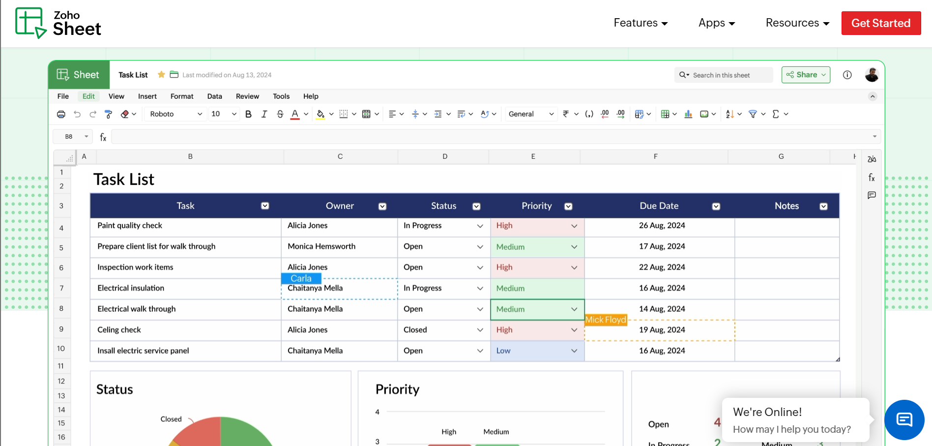
3. Zoho Sheet
Part of the broader Zoho suite and a strong pick for teams already inside that ecosystem.
- Solid collaboration
- Data cleaning
- Integration capabilities at a competitive price
A comprehensive option for general-purpose analysis.
Database and workflow hybrids
4. Airtable
Combines a spreadsheet interface with a relational database.
- Multiple views (grid, calendar, kanban)
- Rich field types
Also, its automations make it strong for organizing projects and structured data that a flat sheet handles poorly.
Better for managing records than for heavy numerical analysis.
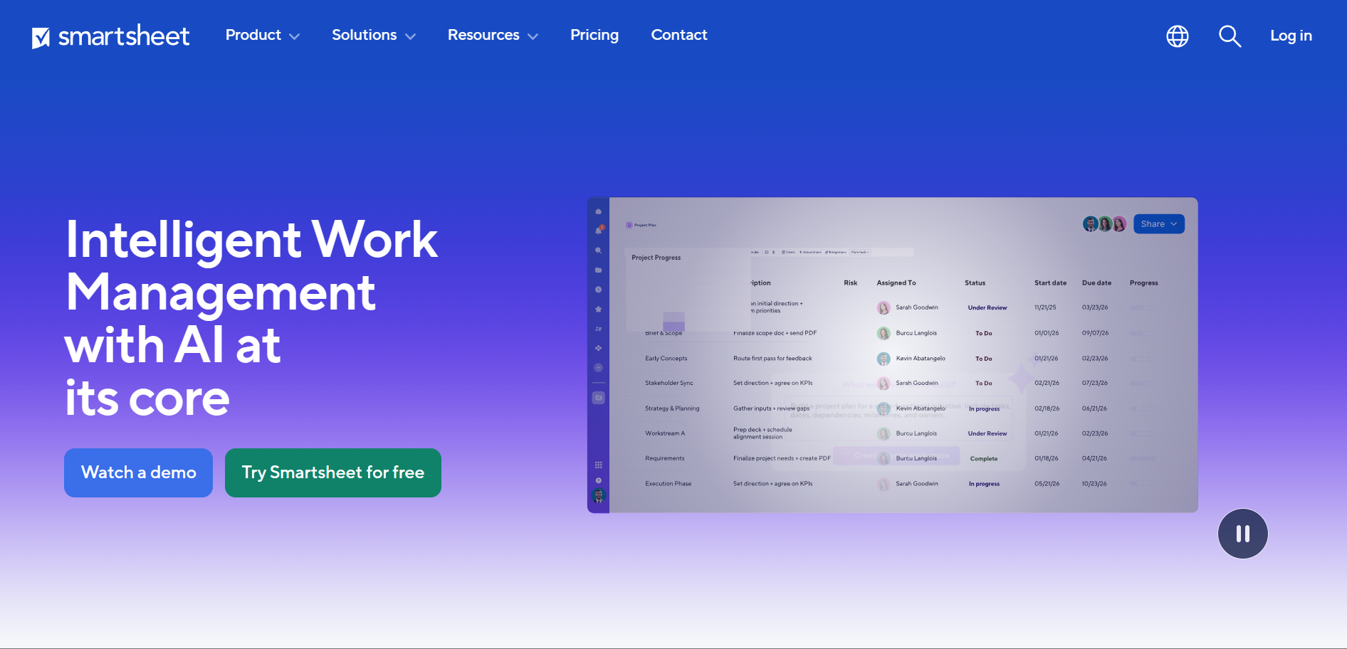
5. Smartsheet
A work-management platform with a spreadsheet feel.
- Timeline
- Board
- Grid views
Plus automation suit teams running complex projects across many stakeholders.
Capable software that extends well beyond traditional spreadsheets, though some analysis features (like pivots) sit behind paid add-ons and the learning curve is real.
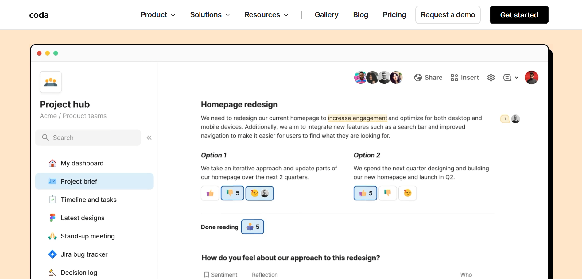
6. Coda
- Merges documents
- Spreadsheets
- Lightweight apps into one surface
Packs and automations turn tables into workflows.
Popular with teams that want analysis to live alongside docs and project tracking, less suited to pure number crunching at volume.
AI-native and connected spreadsheets
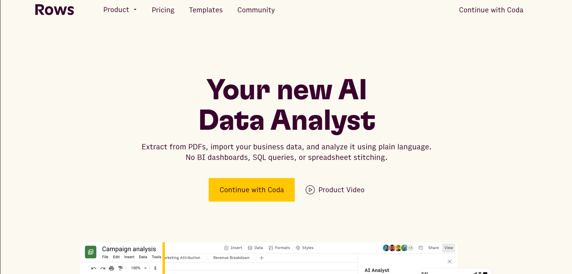
7. Rows
An AI-native spreadsheet built around data connectors and natural-language analysis from the ground up.
Instead of bolting AI onto a grid, Rows designs the experience for users who would rather describe an analysis than write the formula.
A strong free tier makes it easy to trial.
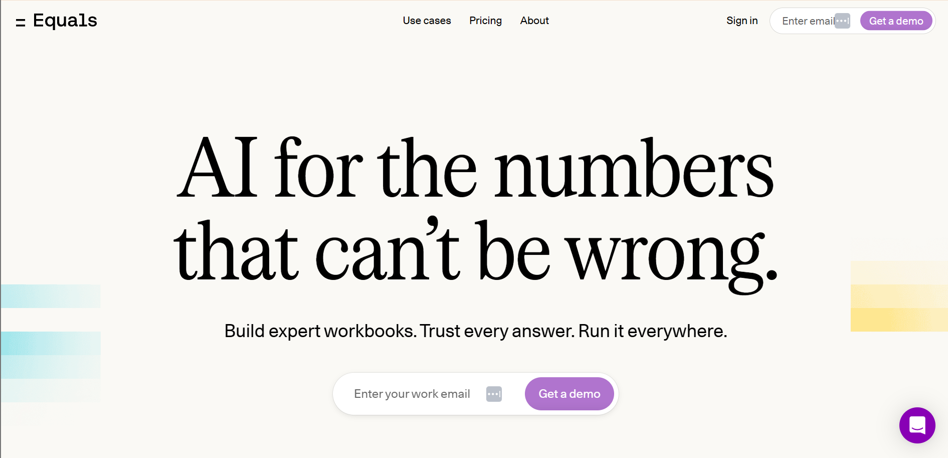
8. Equals
A modern spreadsheet that:
- Connects directly to databases and APIs
- Pairing live data integration with the familiarity of cells and formulas
Built for teams that need real-time analysis without abandoning the spreadsheet muscle memory their analysts already have.
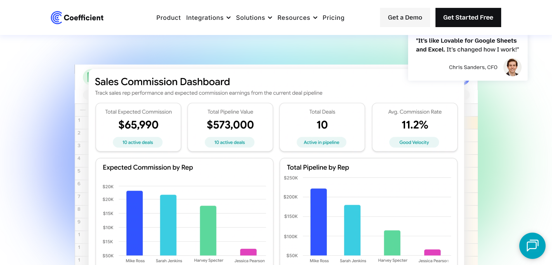
9. Coefficient
Less a standalone app than a live-data layer for Google Sheets and Excel, pulling current data from CRMs, databases, and SaaS tools into the sheet you already use.
It solves the staleness problem directly.
The augmented analytics layer
10. Scoop Analytics
The other nine tools help you build the spreadsheet.
Scoop answers the question the spreadsheet was built to ask.
It is an AI data analyst that connects to your spreadsheets and source systems, blends data across applications, and investigates it:
- Finding patterns
- Diagnosing root causes
- Returning answers in plain English
- Evidence behind every conclusion attached
The distinction matters for decision making.
A spreadsheet shows you that revenue dropped.
Scoop tells you why, which segment drove it, and what changed, without you writing a single query.
It runs natively where ops teams already work, including inside Slack, so a question typed in a channel comes back as an investigated answer.

Where Scoop fits:
Not as a replacement for Excel or Google Sheets, but as the interpretation layer on top of them.
You keep your spreadsheets.
Scoop scales the analysis your best people would do if they had time to look at everything, every day.
- Connects to spreadsheets, CRMs, databases, and 100+ sources with no migration
- Ask questions in plain English, no SQL and no formula-writing
- Autonomous investigation that surfaces the cause, not just the chart
- Built on your data, not copies of it, with the evidence trail intact
Spreadsheet apps compared at a glance
Use this table to match a tool to the job.
The right pick depends less on raw features and more on where your decisions currently stall: data freshness, collaboration, scale, or interpretation.
When do spreadsheets stop working for decisions?
Spreadsheets stop working when the cost of a wrong cell exceeds the convenience of the grid.
Early success hardens dependence: a tool that accelerated growth quietly becomes the constraint. The warning signs are consistent across industries.
- Reports take days to assemble and arrive already out of date
- The same metric reads differently in two teams' workbooks
- Volume triggers slowdowns, crashes, or the million-row wall
- Nobody fully trusts the number, so decisions slow down
Your BI tools and spreadsheets show what happened.
The bottleneck is knowing what it means and what to do next. That is exactly what the augmented analytics platform category was built to solve, by automating the legwork that prevents judgment from happening.
The move is not to rip out your spreadsheets.
It is to add a layer that interprets them.
Teams that make that shift describe the same outcome: analysts stop keeping their head above water on "what happened" and start spending time on "so what" and "now what."
For the natural-language side of that shift, see which BI tool has the best natural language query features.

How to choose the right spreadsheet app for your team
Choose by the decision you are trying to make, not the feature list.
Work backward from where your process breaks today.
If you model and forecast:
Excel for depth, or Equals if you need live database connections in a familiar grid.
If you collaborate constantly:
Google Sheets for free real-time editing across a team.
If you organize structured records:
Airtable or Smartsheet for relational views and workflows.
If your data is always stale:
Coefficient to pipe live data into the sheet you already use.
If you want answers, not maintenance:
An augmented analytics layer like Scoop that investigates the data and returns the decision-ready insight.
Frequently asked questions
What is the best spreadsheet app for data-driven decision making?
There is no single best app, only the best fit for the job. Microsoft Excel leads for deep modeling, Google Sheets for free real-time collaboration, and Rows or Equals for AI-native and connected analysis. For teams that want answers rather than more spreadsheets to maintain, an augmented analytics layer like Scoop Analytics investigates the data and returns the insight directly.
- Excel: depth and modeling power
- Google Sheets: collaboration, free
- Scoop: interpretation and autonomous investigation
Are spreadsheets reliable for important business decisions?
Spreadsheets are reliable for capture and light analysis, but risky as the final word on high-stakes calls. Studies put the share of business spreadsheets containing errors between 88% and 94%, and a single broken cell can cascade through an entire model. The safest pattern is to use spreadsheets for input and modeling, then validate the conclusions with an analytics layer that keeps an evidence trail.
- Manual entry is the top source of error
- Live connections reduce staleness and mistakes
Can AI replace spreadsheets for data analysis?
AI is not replacing spreadsheets, it is changing what they are for. Tools like Copilot and Gemini handle formula-writing inside the grid, while augmented analytics platforms handle the interpretation above it. The spreadsheet stays useful for structured input. The analysis and the "why" increasingly move to AI that can investigate across sources.
- AI inside the sheet: faster formulas and pivots
- AI above the sheet: root-cause investigation
What is the difference between a spreadsheet and augmented analytics?
A spreadsheet stores and calculates. Augmented analytics interprets. A grid shows that a number changed. Augmented analytics tells you why it changed, which segment drove it, and what to do next, in plain English and without a query. One is a place to put data; the other is a way to get answers from it.
- Spreadsheet: what the numbers are
- Augmented analytics: what they mean
Do I have to replace my spreadsheets to use Scoop?
No. Scoop sits on top of the tools you already use. It connects to your spreadsheets, CRMs, and databases without migration or copies, then adds the interpretation layer. You keep Excel and Google Sheets for what they do well and let the analytics layer scale the analysis your team does not have time to run by hand.
- No migration, built on your existing data
- Works alongside Excel, Sheets, and your BI stack